The Queen Museum is a companion app for a visit to an exhibition which helps the visitor visualize the items contained in an hypothetical physical museum. The development of the application is based on the MMMM acronym, which stands for Multimedia Museum Meta Mirror. As specified in the requirements, the Queen Museum app offers a virtual visit of items whose history is connected to the lives of three monarchs and one princess of the United Kingdom.
Meta Mirror: the application offers a complete overview of the content of a museum.
Museum: the digital companion is an online counterpart of a physical museum, which explores the role of the royals in our culture through the items that belonged to them. The application helps the visitor to plan the visit and explore the physical structure of the museum digitally.
Multimedia: the application is populated with several images and text describing in detail every item contained in the museum. The Home page offers a timeline helpful for visualizing every item in its time context, and on the Map page a real configuration of the rooms is presented to help the visitor organize the tour.
The Queen Museum exhibition counts 19 items - 4 or 5 objects for each monarch - which are presented according to two different narratives. The Historical Narrative presents the item in a chronological order, focusing on the historical period to which they belong and their important role in a specific period of time. The second narrative focuses on the role that these items have in the construction of the persona of these royals in popular culture and why they became an integral part of the narratives around these royals' lives. According to the selected narrative, the descriptive text on each item page changes, as well as their presentation order in the Exhibition section.
To dive deeper in the museum content, each item is accompanied by a text which can be expanded or shortened according to one’s interest through the “show more” and “show less” buttons. The application is developed to satisfy every age group, which led us to devise texts suitable for both children and adults; these can be selected also by clicking the buttons to change the difficulty level. As mentioned before the texts also adapt to the selected narrative, focusing either on the historical value and role of each item or their influence in popular culture.
2. Presentation
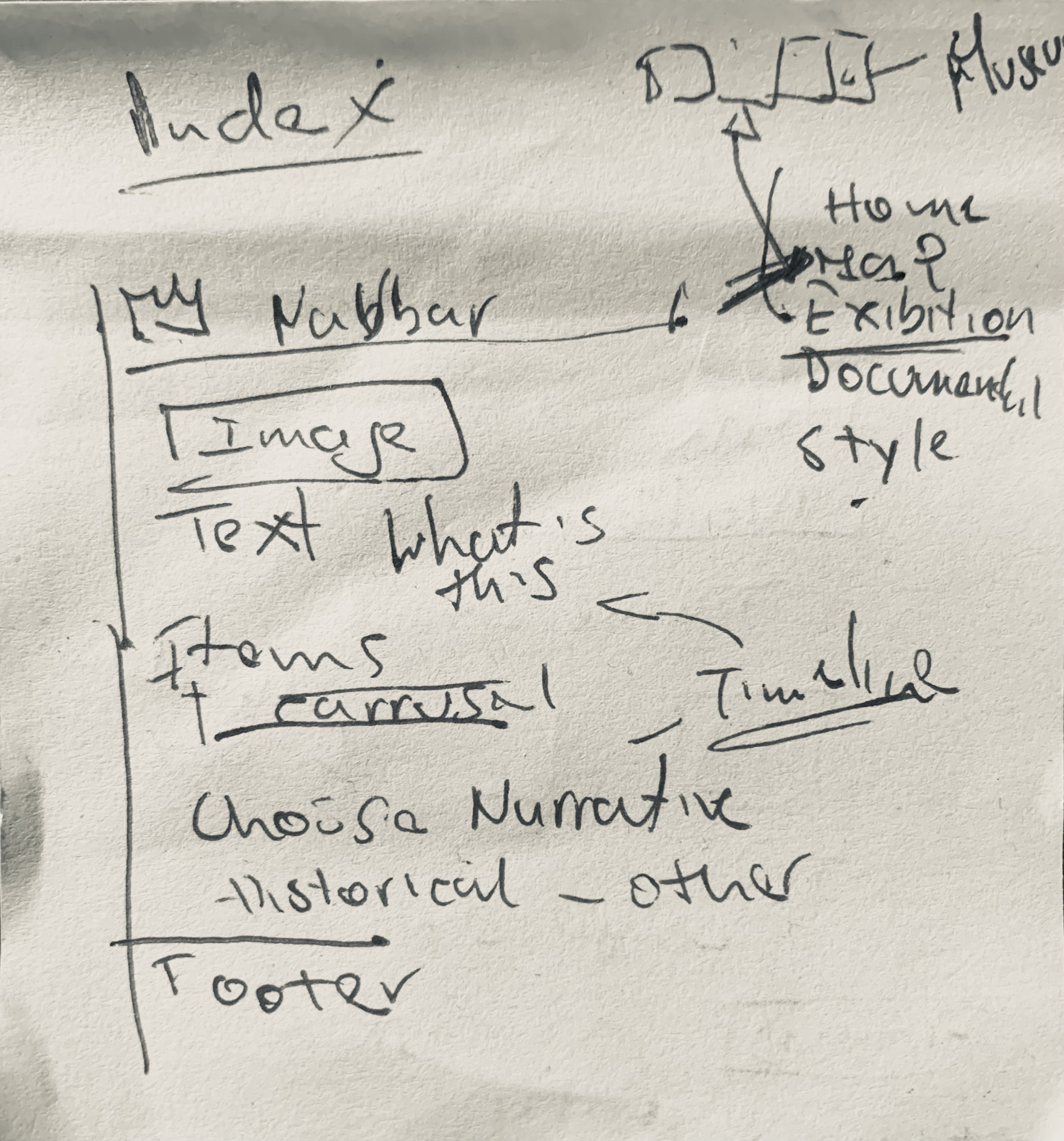
The application is composed of three main HTML pages that first introduce to the visitors the content of the museum and then explore in detail every item in the collection.
To set up the general layout and rules, we used a base CSS file, style.css, which allowed us to specify the rules that must apply to every page independently of the selected theme. The themes and their specific characteristics will be explained in Section 3. In every HTML page, the visitor can find the navigation bar, which allows users to orient themselves within the site by highlighting the current open section through the class=”active” applied to the links in the navbar. By clicking on Choose your theme, the visitor has the possibility to select the style applied to the current visited page.
After the <body>, all information about the creators of the application, the GitHub repository to access the HTML, CSS and JS files, and the copyright statement is enclosed in the footer.
2.1 Home page
The Home page is the first thing that the visitor sees while opening the application. It provides a general overview of the content of the app. There are four main sections that summarise the scope of the museum and the collection. First, we decided to insert a carousel of pictures to introduce the main characters of the museum and the title, to immediately communicate the project’s intentions.
A brief introduction is then provided in the About the Museum section. Here we present the scope of the project, the intentions behind this application, and a short biography of every important woman involved in the exhibition.
The Items section focuses on the actual content of the virtual exhibition and describes the criteria followed to organize it. Each royal presented in the card corresponds to one room.
Finally, the Timeline section contains a timeline realized with the TimelineJS tool, which allows the visitor to view every item in the collection and contextualize it within its historical period.
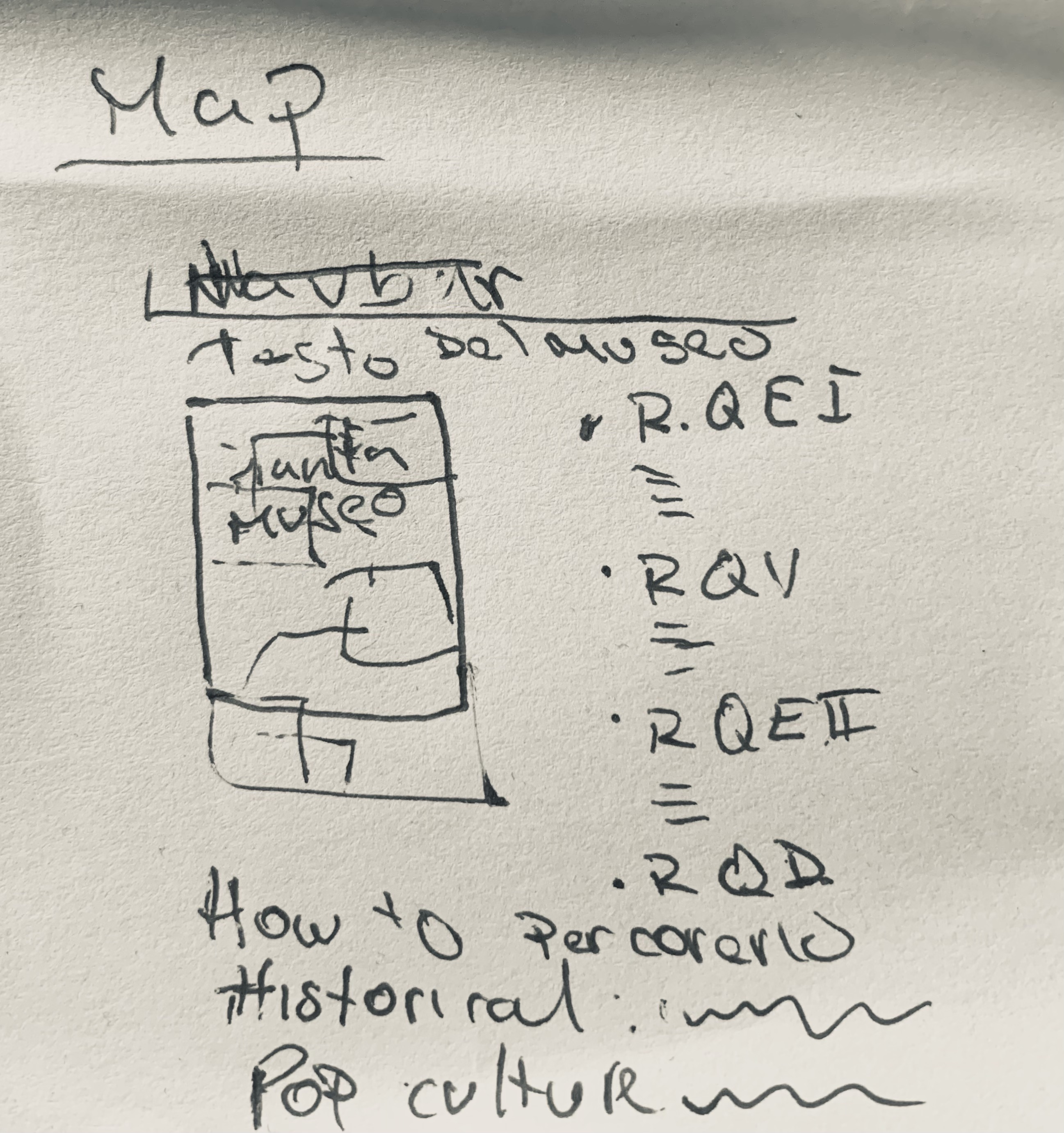
2.2 Map page
After the general overview provided by the Home page, it is possible to access the map of the museum by clicking on the Map link in the navigation bar. The museum's physical structure is divided into four main rooms, two on each side, separated by a corridor. The rooms are named after the Queen or Princess to whom they are dedicated. The rooms highlight or change colour when the visitor points at them with the cursor. This behaviour is achieved through the :hover pseudo-class applied to each room, signaling that they are clickable.
Next to the map, a section called Explore the museum lists all the items contained in each room. By default, the items are listed following the chronological order also used in the Home page timeline, but their order changes when clicking on the Queens in popular culture button above the map. This section is important because it presents the two narratives used to tell the story of the royals through their items. By changing the narrative, the order of the exhibition is also modified to better fit the narrative arc. The list under the Explore the museum section is populated by the buildList function in the main.js. To inform the user which narrative is selected, we created buttons that change their appearance while clicked with the .active selector.
By clicking on a specific room, the user will be redirected to the Exhibition page, specifically to the first item in the list, which varies according to the selected narrative. Each item listed in the Explore the museum section, when clicked, redirects the user to the corresponding item page, where the metadata and the descriptive text can be viewed.
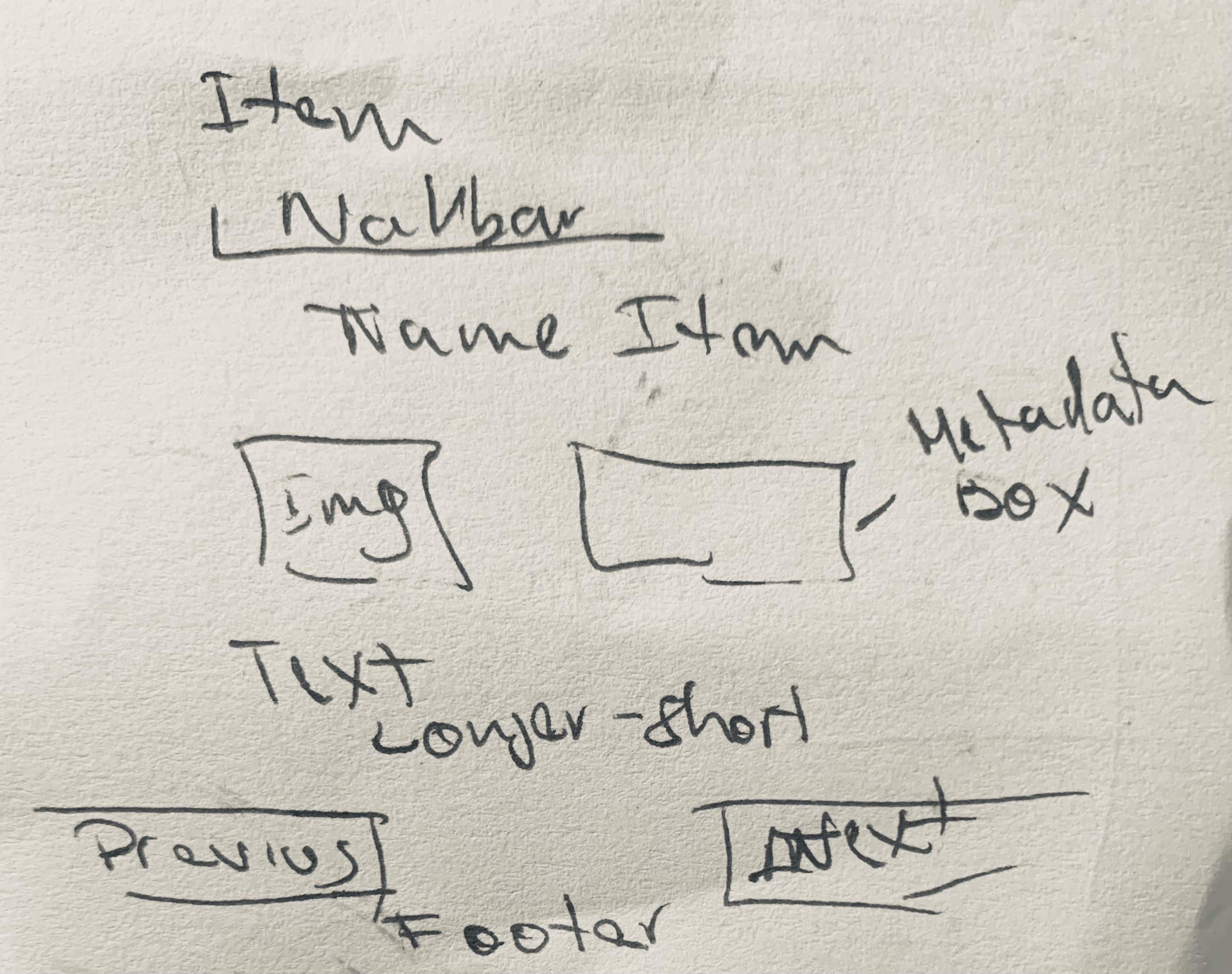
2.3 Exhibition page
The Exhibition page is the section of the application where each item is presented with detailed information about its characteristics. The entire page content is populated by the updateContent function in main.js, which retrieves all information about the items stored in the constant variable defined at the beginning of the JavaScript file. The function takes into account the different positions of the items depending on the selected narrative. This behavior is implemented through the updateOrderedItems function, which reorganizes the exhibition by accessing the order specified in the const item array.
The layout consists of a title section, a carousel below it, and a metadata table positioned on the right. The carousel displays multiple images of the item to provide a more comprehensive overview. The metadata table briefly describes each item using the following attributes: Full Name, Date, Place, Materiality, and Room.
Below this section, the visitor can find a complete and in-depth description of the object. The showLess and showMore functions, together with their corresponding buttons, allow users to control the amount of text displayed. Each item is described through three levels of text: a short description with essential information, a medium-length text that expands on the basic description, and a long text that provides additional details and curiosities about the objects in the catalogue. This structure applies to both narratives, with variations in focus depending on the selected one.
The application is accessible to both adults and children, as shown by the buttons that adapt the complexity of the text according to the selected mode. Through the “Previous” and “Next” buttons, users can navigate through all the items in the collection and explore the stories behind each of them.
3. Themes
As specified in the guidelines, we applied to the application four different themes which can be defined as completely unique ways to present the content of the museum. The different themes affect the design of the website by modifying the colours, font families, measurement and the general visual output the visitor faces while exploring the application. To ensure a broad variety of styles, we choose each theme from a different historical period. Every choice and design feature will be further explained in the following sections.
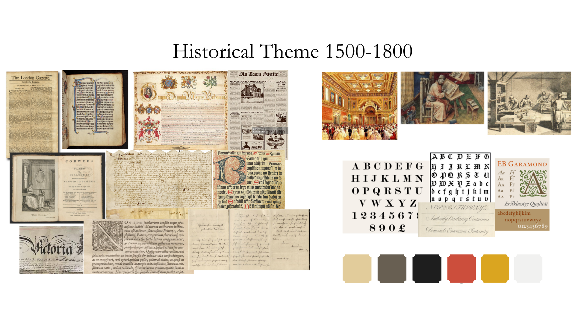
3.1 Historical:
This theme is called Historical and is inspired in the style and layout of late medieval manuscripts, and royal decretes or diplomas issued during the 16th and 17th century. We also took inspiration from the first wave of printed books after Goutember's press publish between the 16th and 17th century. We chose to portrait some of the main characteristics of these books and documents, especially regarding the layout of the pages and how the information was placed inside the page. The physical support of manuscripts were usually parchment where the text was written in some type of metallic ink. Sometimes the first letter of the text, called the initial, was highly decorated, called Illuminated initial. The text inside the page was usually surrounded by highly decorated borders, usually with the prominence of the colors blue and red-burgundy, while the style of calligraphy used in the manuscripts of northern Europe was the Gothic script. Instead in printed books the layout of the pages were much simpler, without so much decoration and typically using a for the letters the font Garamont.
Hence for the creation of this style we decided to consider the characteristics mentioned above to re-create an atmosphere that exemplifies the written and printed text of the periods chosen.Proportions and balance principles were followed while coding this theme because the aim was to closely resemble. For the background color of the web pages we use the hex color codes #F6DFC1 and #fcf4e9 for the navbar that reminisces the yellowish of medieval parchment. For the main titles in the pages, usually those encapsulated in <h1>, <h2>, and those in the navbar the name of the pages we decide to use a the font “UnifrakturCook” from google fonts that remembers the Gothic script used in Manuscripts to capture the attention of the visitor . While for the general text inside the pages usually encapsulated in <p> we used the font “Garamond” that is the same used in printed books of the 17th century. Since it was common in royal decretes and in manuscripts that the first letter of the text or initial was bigger that the following letters sometimes going under the line also called Drop cap, we decide to incorporated as well this characteristic at the beginning of each text section in the Home Page. For the images placed in the pages we opt to put a burgundy color border around all images to remember the highly decorated frames of manuscripts.
Vision board for the Historical theme
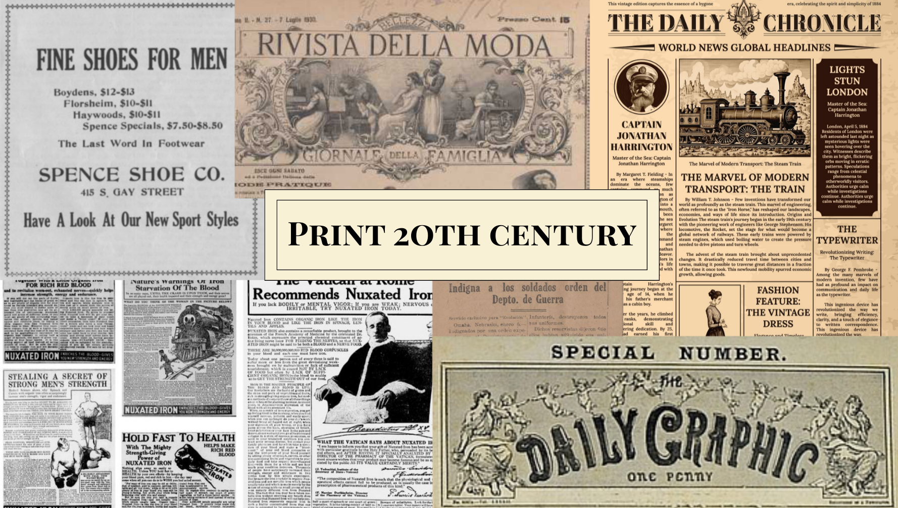
3.2 Print 20th century:
This style is inspired by the early years of the 20th century, in particular by important media such as the journal, which underwent pagination and content changes during this specific period. At the beginning of the 20s, many newspapers started to use graphics and layout to stand out from the competitive market. Headlines, articles and images became a way to hierarchize the news. During these years the symmetrical layout becomes important to obtain a balance between columns containing articles. The pages are characterized by many separated sections, fonts, mainly bold for the titles and thin for the articles, illustration and decorative frames which contributed to the enrichment of the layout.
To simulate a newspaper with different pages and articles we used different separated sections to mimic the articles separation. This is why every <div> element is different from the other and separated by a separation line which is implemented by the class .section-divider and by the pseudo element ::before which allows us to apply the separation line after the <div> selected. Other framing techniques consist in assigning to a certain section a color that differs from the typical ivory of the journal paper, which is also the background color assigned to this theme. We used the #2C2D2D Hex Code which can be named as Light Black that resembles the shade of black observable in printed paper. For the text section in the Exhibition page we used a lighted shade of the same colour, #2c2d2d41, to ensure readability. <div> elements like the Items section in the Home Page or the Explore the museum section in the Map page have a darker background to capture the attention of the visitor. Since it was common to insert different captivating titles to arouse curiosity in the reader and make journals visually appealing, different fonts were used to seek variety. IM Fell English is typically applied to <p> elements or secondary titles that are not the main focus of attention. The Playfair font family is applied to important titles that need to capture interest because of its bold nature. Smaller layout section but still important use the .playfair-sm variation where the font-size is slightly smaller, of only one rem, being it 2rem, but still captivating. Finally the last font-family used is the Pinyon Script in cursive. It is applied to the names of the royals in the Home page because of its elegant configuration which highlights the importance of those names.
Many decorations are applied to almost every section. A double border is applied to sections with class .frame thanks to the preuso-element ::after. Another type of decoration is the one identified by the .floral-dec class and its pseudo-elements ::before and ::after to apply two flower icons at the sides of some titles. In other cases PNG format pictures are used to surround other sections worthy of attention by using the property border-image-source and inserting the path to my PNG image. Other little illustrations were put to decorate the Map page, again by using the pseudo-elements previously discussed. These two illustrations do not appear when the viewport is smaller than 62rem as specified in the @media rule.
Proportions and balance principles were followed while coding this theme because the aim was to closely resemble a typical newspaper.
Vision board for the Print 20th century theme
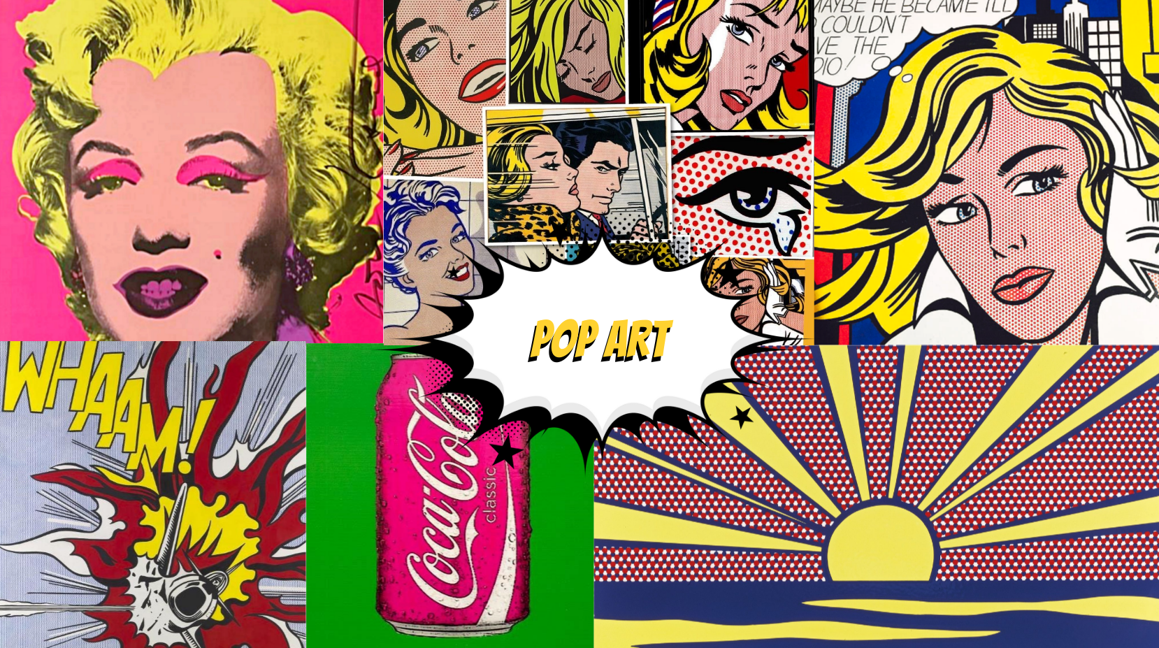
3.3 Pop Art:
The Pop Art theme is inspired by the historical period between the 1950s and the 1960s, during which a new art movement emerged, influenced by commercial and popular culture.
Pop art drew significant inspiration from television, comic books and magazines, combining easily understandable images with reflections on the contemporary historical context and societal values.
The Pop Art theme, which can be selected through the site’s theme menu, aims to present the elements of the application by fully embracing the stylistic features associated with Pop Art. We drew inspiration from artists such as Roy Lichtenstein and Andy Warhol to present the application in a colorful and cartoonish manner.
The Home page, as well as all the other HTML documents, resembles Roy Lichtenstein ‘s comic based artworks, characterized by bright colours and dotted patterns. The body background is pink, a vivid color enhanced with white dots created by using the CSS property background-image: radial-gradient(circle, white 10%, transparent 20%).
Both the navigation bar and the footer are styled in DodgerBlue, a colour frequently used in Pop Art palettes and characterized by strong contrast with the pink background. All colors selected for this theme are bright and highly contrasting, with the exception of frames surrounding longer text sections, whose background color is wheat. These lighter areas are intended to resemble comic speech balloons and are framed with rounded borders typical of comic illustrations. Many layout elements share this border style to visually separate sections from one another. The same approach is applied to the carousel on the Home page, where a PNG overlay with a focus effect is added above the royals’ images to enhance emphasis and capture attention as soon as the visitor opens the application, similar to visual effects commonly used in comics.
A cartoon style PNG is applied to title elements to distinguish them from the rest of the text and make them stand out, resembling exclamations in comic panels. The font family used for this theme is Bangers, a bold and cartoonish typeface that evokes the impactful typography of comic books. Titles are displayed in bright yellow, while the main body text is black, with key words or names highlighted in bright blue. Shadows are applied to text and selected elements to further emphasize their importance and add a cartoonish layer.
The dimensions and proportion of the elements in this theme are carefully calculated to ensure visual harmony and readability, drawing inspiration from both comic layouts and the golden ratio. Relative units such as rem, % or vh to guarantee responsive scaling across different viewport sizes and to facilitate usability on both desktop computers and smartphones.
Vision board for the Pop Art theme
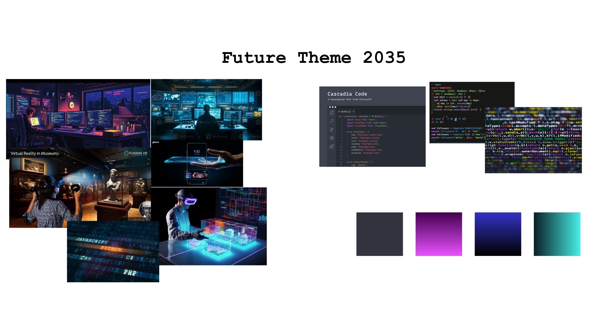
3.4 Future:
This theme style is called Future, and is inspired in a Futuristic vision of the year 2035. Since we cannot know what would be the word in 10 years, and less what would be the tendencies of the moment, we decided to interpret and imagine what our future will be considering the characteristics of our current world, a little bit of imagination and inspiration in movies that take place in an imaginary future world. We considered that today there is a big proliferation of the use and work with technologies that are developing very fast and practically everything today is related to virtual environments and the web. Therefore this is strictly connected in how technology is developed with programming languages and more people are learning to use code in different ways. More and more people work with computers and live in a virtual world, making use of screens, monitors and virtual reality tools. This realization makes us think about a movie of the late 1990s, “Matrix” that takes place in a dystopian world in which the world is programmable with lines code.
Hence for the colors of the website we choose background colors close to black since usually in code editors and in “Matrix” the background is black with the letters in bright neon colors, such as green that is the one use in Matrix, and other such as blue and purple-pink all very neon-bright. Hence for the background color of the pages we use the hex color code #262626 and for the navbar, footer and some buttons we use a more darker tone that is #000 to make the visitor be able to recognize different parts of the site. Instead for the general text in <p>we use white so it could be recognisable in the dark background. For the titles we use the color #00e600 that is the typically neon matrix green, for the rest of buttons in the page we use #cc00ff that makes contrast with the rest of the elements and ensures readability for the user. Therefore we decided to create the website with the fonts “Cascadia code” and “Courier new” that are the fonts typically displayed in code editors and in the terminal of the computer when dealing with programming languages. Proportions and balance principles were followed while coding this theme because the aim was to closely resemble a future where everything is done with code.
Vision board for the Futuristic theme
4. Metadata
We gathered metadata of each item from the museum, library, and archive websites that houses each item, supplemented by additional references documented in the disclaimer section. All metadata was standardized using the Dublin Core Metadata Element Set to ensure interoperability.
5. Disclaimer
The purpose of this web site is to explore various types of typographic and layout styles for museum pages, as an end-of-course project for the "Information Modeling and Web technologies" course of the Master Degree in Digital Humanities and Digital Knowledge of the University of Bologna, under prof. Fabio Vitali.
The documents contained in this web site have been selected for their length and complexity from the following resources.
Their publication here is not intended to be an alternative or replace their original locations: